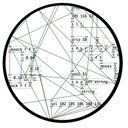
Are there any alternate icons (pd.icns/pd.ico) for Pure Data. I mean others than those provided with Pd/Pd-extended? Note that i am already aware of the ( https://puredata.info/community/member-downloads/logos ) entry.
-
Cute pd.icns?
-
@NoDSP: Love them.
@Alexandros: The name of the software is also "Pure Data". It seems that it is always reduced to Pd. I did not suggested to change the name of the software. I rather like it. But an icon with "Fag" on it is not really a plus when you teach for child at school for instance. Am i the only one to complain? Yes. Sorry for the inconvenience.
-
@tomate said:
But an icon with "Fag" on it is not really a plus when you teach for child at school for instance. Am i the only one to complain? Yes. Sorry for the inconvenience.
Well, I have to admit that this perspective does have a reason to change that icon... sorry for the noise..
-
Noise is welcomed. Probably that nobody has the time to make an up-to-date icon. Especially with the prospect that unanimity would be impossible to obtain.
-
I've heard many french Pders say "pidi" for "Pd" in a desperate move to avoid the infamous "pédé". I say "Pure data" with no english accent whatsoever (with a french one, actually). As long as it's the "official" logo, i'd say you're no doing your pupils a favor by hiding the "real" icon. What if they want to use it at home ?
[pd subpatch]
mypatch.pdHow will you avoid these ?
-
@dwan:
Don't be zealous. But the software name (and icon) is something that matters (specially with nowadays OS and stores). For instance in french if you search "pd" in google you get "On va casser du PD" before the "Pure Data" website ( https://www.google.fr/?gfe_rd=cr&ei=Jyb1VfrQBM7AbJH-vagO&gws_rd=ssl#q=pd ).
But anyway there is zero chance to change, and the dumbass "Pidi" workaround will remain until the end. If my memory is correct you finished the french translation that i resurrected few years ago on the codelab forum... and that has never been commited to vanilla. Ah Ah Ah.
EDIT: To be fair i have to notice that the Matteo Renzi's "Parti Démocrate" ( https://en.wikipedia.org/wiki/Democratic_Party_(Italy) ) seems not agree also with my POV.
-
Come on, do you really google "pd" when searching about Pure Data ? Plus "on va casser du pd" is a South Park video
 .
.Anyway, i made an icon based on the numix project one.
-
I have to notice that the original post was mainly about how much ugly and outdated is the icon in my opinion. But as usual when somebody evokes whatever discriminations overreacting become the rule. Sorry, probably my case also. Mea culpa.
Personally i don't like the grey circle, but i have to admit that it could be a good base to design a new icon. I think that it should be done by a true icon designer (or student with a minimum knowledge in color charts and such).
-
That's just meant as a politically correct icon for the OP. I made some other edits. It's hard to think of an original icon, as Pd doesn't have a real logo...


